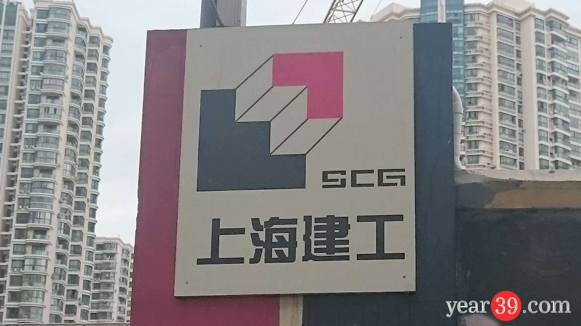
I always keep my eye out for great design as I travel and today I found a logo which is right up my street.
I love design with double meanings and this logo for Shanghai Construction Group really delivers on this. The company generally builds high rise buildings and the red corner looks like a skyscraper if you see it as being in front or above the blue shape. If you see the red corner as being set back you see a set of stairs. I think it is really clever and just the sort of design I really appreciate.

